Guides · Images
How many pixels do you really need?
Too few and the image looks soft; too many and the page gets heavy for nothing. Here is how to find the right size, with real numbers.
Short answer. Take the size at which the image is shown and double it, for sharp Retina screens: an image displayed 800 pixels wide needs 1600. More than that adds weight, not sharpness.
For print the rule is different: 300 pixels per inch of paper. An A4 page needs about 2480 × 3508.
Every image has a right size. Below it, it looks soft or blurry. Above it, nobody sees the difference, but everyone downloads it: the page gets slower, the email heavier, the folder fuller. Finding that size is less obvious than it seems, because the pixels of an image and the pixels of a screen are not the same thing.
Screen pixels are not image pixels
Websites measure everything in “CSS pixels”. On an ordinary screen one CSS pixel is one physical pixel. On a Mac with a Retina display, an iPhone or most recent phones, one CSS pixel is made of 2 × 2 or even 3 × 3 physical pixels.
So an image that occupies a box 800 pixels wide on a web page is actually drawn with 1600 physical pixels on a Retina Mac. If the file is only 800 pixels wide, the screen stretches it, and it looks slightly soft next to the sharp text around it.
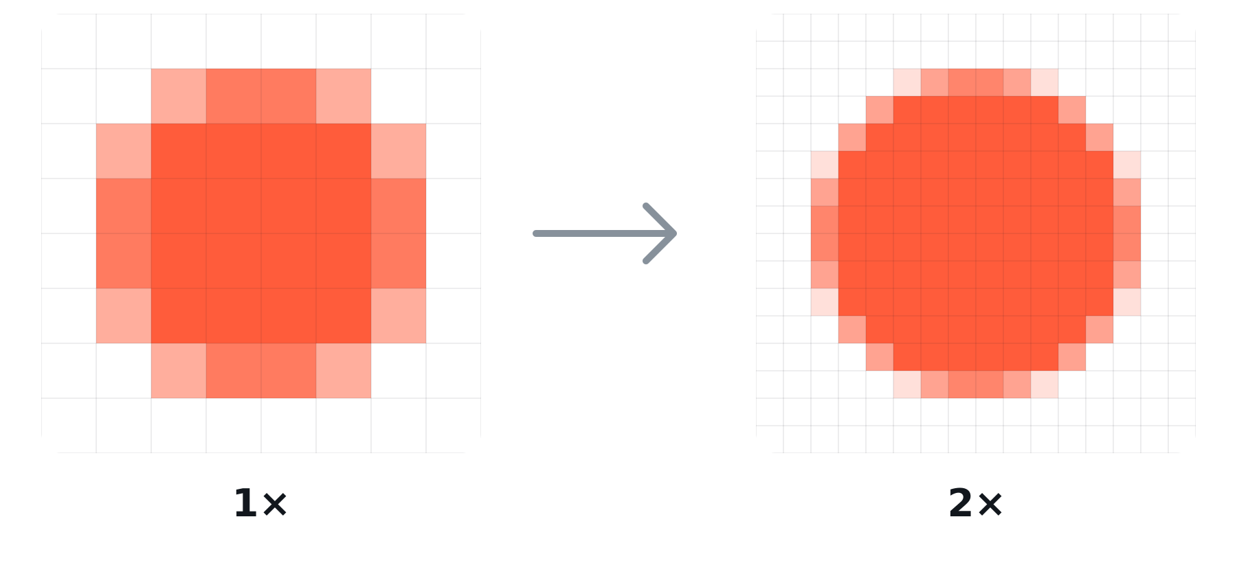
The rule of thumb: displayed width × 2. Three times is only worth it for small images on phones, such as icons and logos.
Every extra pixel has a price
The weight of a photo grows with its area, not its width: double the width and you have four times the pixels. We measured it on nine photos, saved as JPEG at quality 80:
| Width | Average weight | vs 1440 px |
|---|---|---|
| 640 px | 60 KB | ×0.2 |
| 1080 px | 165 KB | ×0.6 |
| 1440 px | 288 KB | ×1 |
| 2048 px | 587 KB | ×2 |
| 2880 px | 1.1 MB | ×4 |
| 4096 px | 2.3 MB | ×8 |
A photo straight from a camera or a phone, 4000–6000 pixels wide, can weigh 3–10 MB. On a web page where it’s shown 720 pixels wide, it needs 1440: a tenth of the weight, with no visible difference.
How many pixels, case by case
Websites and blogs
Look at the width at which the image is shown, on a large screen, and double it.
| Where it appears | Shown at | File width |
|---|---|---|
| Thumbnail in a grid | 300–400 px | 600–800 px |
| Image in the text column | 700–800 px | 1400–1600 px |
| Wide image, full content width | 1100–1200 px | 2200–2400 px |
| Full-screen cover | 1440–1920 px | 2560–2880 px |
If your site supports it, offer two versions of the same image (1× and 2×, with srcset): phones and ordinary screens download the light one, Retina screens the sharp one.
Social networks
Social networks recompress everything you upload, and above a certain size they shrink it themselves, often worse than you would. Upload them at the size they use: on Instagram, 1080 pixels wide (1080 × 1080 square, 1080 × 1350 portrait). A 6000-pixel file doesn’t look better: it’s just reduced by someone else.
Whoever receives it will look at it on a screen, often a phone. 1280–1600 pixels on the long side are plenty, and keep a dozen photos under 10 MB.
Here what counts is the paper: about 300 pixels per inch (118 per centimetre) for prints seen up close. The “dpi” value in the file doesn’t change the image: only the pixels matter.
| At 300 dpi | |
|---|---|
| 10 × 15 cm photo | 1181 × 1772 px |
| A4 (21 × 29.7 cm) | 2480 × 3508 px |
| A3 (29.7 × 42 cm) | 3508 × 4961 px |
A poster seen from a few metres needs far less: 150 dpi is enough.
Never enlarge
Reducing an image is easy and harmless. Enlarging it doesn’t add detail: the software can only invent pixels between the existing ones, and the result is soft. If an image is smaller than you need, it’s better to look for a larger original.
In Misuro
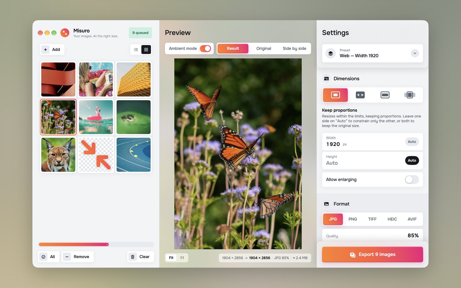
Set the width (or the long side) and leave the other side on Auto. Allow enlarging is off by default, so images smaller than the requested size are never stretched. The ready-made presets already use these sizes: Web 1920, Email 1280, Social 1080 × 1080 and 1080 × 1350, 4K screen.

Misuro for Mac
Bring batches of photos to the right size, with presets for web, email and social. Offline, one-time purchase.

Read next
Photo credits
Cover photo: Future Canvas on Unsplash+.
Test photos: Cristina Gottardi, Dan Otis, Denys Nevozhai, John Towner, Kristaps Ungurs, Laurine Bailly, Martin Adams, Michael Bourgault on Unsplash; Lisa Fotios on Pexels.